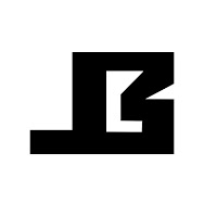
I started by sketching some ideas down and trying to come up as many logo designs as I could, most of the inspiration that I got was from looking at other companies with the same initials as me so that I could see how they used their logo to represent themselves. I felt like my design should demonstrate the work in with I produce so I decided to design my logo with straight and clean cut edges, which will represent my modern style. These are some on the designs I came up with.
Out of my designs that I had made I did quite like the top right one and the bottom right, just because I found that with these logos I could come up with the most ideas for ideas. So with these I went onto photoshop and started to neaten things out and make the designs better. I thought about using colour on them but I just figured that they would look better in black and white. Below are my improved logo ideas.

I also went into Maya and made one of the logos 3D so that I could see how it would look and also give me a better idea of what the ident would look like with this logo design. With the other logo design I was thinking more 2D motion graphics and like having it like spin out for the ident, but I will have to try and experiment with this logo more.


No comments:
Post a Comment