Sunday, 15 May 2016
Brand Me: Creative CV / Letter Head
For the creative CV I placed my email, phone number, Instagram name, and address in the top right of the page, I then added my name and what I do with a little profile saying what I'm like and what I do. I then added in my education with the grades I got along with the education. Underneath that I told them about my skills in animation software and some of my qualities I have .
I feel like this is a good starting point for a creative CV because it shows what I can do hand and what skills I have. It's also good because its not filled with rubbish which isn't needed and it is simple and gets to the point.
For the Letter Head I wanted to keep the same theme as the CV just so that the consistency through out my branding is well kept.
For the letter I just placed in text that says what is needs for sections in the letter and then I said at the bottom is where my address and my website address would be if the person I'm sending a letter to ever wants to get back to me.
Brand Me: Making A Showreel
For this brief we have to create a showreel which shows of are best work that we have done so far in animation. At first I thought that this was going to be an easy task and it wouldn't take long for me to do but I was wrong.
The first thing I wanted to do was collect all of my finished animations and go through and see which ones can go in my showreel and which ones can't. After that I realised I didn't have that much to show so I then looked in my own work file and found some animations and effects videos that I could also place into my showreel. To put together my showreel I used After Effects and yes I know it's not the best software to use and I should of used Premiere Pro but I found After Effects so much easier to edit in.
When I edited it together I started off by importing all the videos I wanted to show, I then looked through them all and cropped them down to the bits that I'd only like to show in the showreel. After that I then tried to put them in an order but I didn't really know what order to put them in, until I realised that I could do an order like, two visual effects then two 3D animations and then repeat that order again and again.
Now that I had my videos in order I then had to find a piece of music which fits in with my showreel. So what I did was I went on to youtube and searched for free chilled instrumental music, this came up with a lot of suggestions and I listened to a load until I found one that I liked and thought it fit in very well. I've contacted the person who's music this was and asked if I could use it in my showreel and not for none profit use, and the person said yes which is great.
I also had to come up with an finishing ident that goes at the end of my showreel that shows my email address. Doing this was easy enough because all I had to do was get me ident and then just change the text to my email and that was it. This is a still of what it looks like.
This is my showreel for now I feel like it represents me well and shows off my skills in animation and visual effects. I do feel like I should probably add a bit more to my showreel but I also feel like I need to produce more work to do so.
Brand Me: Business Cards
So having not designed a business card before I went onto google images and looked at a bunch of different types of cards from business men cards to designer cards. What I found was that business cards don't use that much colour and detail, and they seem very simple and not overly cluttered with information.
I started of by making a couple of designs making sure that they are consistent with my brand theme like colour, font and logo. Many business cards have like a logo, art pieces, or a still from one of their animations on one side of the card and then the information on the other so I thought it would be sensible for me if I did the same thing. I experimented with the layout on the info side of the business card to see where the text would go and how the logo would fit in as well and this is what I came up with.
Front |
Back |
My Branding in Social Media
Branding myself throughout social media is important and it is important to keep the same theme throughout the social media website so that other people don't get confused in who I am and that then know instantly what they're on and expecting to find on the sight. Below are the four social media sites that I am currently on but I'm hoping to stretch further out and create more social media accounts.
With the head banner image thats on Facebook, Tumblr, and YouTube I decided to use an image from the polygon animation just to give a feel of what kind of work I do. It did take me some time to figure out what I was going to do for the head banner image because I didn't know whether I should of put a screen shot of one of my animations on there or not. This I am still contemplating but I might even show a bunch of my work on there by using some sort of grid format so that people understand my work better and what I do.
For my showreel I am going to post that onto Vimeo because once you post a video on there your URL doesn't change, even when you want to update or change the video you keep the same URL. Then I will link my showreel on all of my social media accounts so that my followers can see my work and also go across my social media and check out other work I've done. I think I'll use Facebook and Instagram more than the others because they are the most used sites in the industry and most people have them accounts. With YouTube I'll just upload final animations and videos that I've created and then link that to other social media sites.
Brand Me: Ident Update
At first I was finding it hard to think of an idea of an ident for my new logo because I didn't just want to copy what I did for my past 3D ident but I also wanted to do something like that. I figured that I didn't want my logo to be broke up into multiple pieces but I did want I logo to appear separated at first and then come together to reveal my logo. To create my ident I used After Effects and the plug in tool element 3D, so that I'll be able to experiment more with animating my logo.
I had an idea for the ident where it starts with the logo has been expanded out in the Z axis and then it comes in to reveal the logo and then expand back out, but whilst the logo is expanding in and out it is also rotating on the X axis just so that the logo isn't still at any point throughout the ident animation. This is what it looks like.
However I also made another version where at the end of the ident the logo scales in on itself and disappears instead of expanding back out, just to show that, that was the end of the ident. This looked a little something like this.
However, when I showed the two idents to my peers they all suggested that I should go for the first ident design because the ending of that one looks like it will flow nicely to the next animation/video when I use it in my showreel. So with this information I decided to do as they said and stick with the first ident design I created.
I like the new ident because I feel like its simple but yet effective and it does what I want it to do and it shows in the five seconds that I have in the ident that I am a 3D animator and also work on motion graphics/VFX. I feel like this ident will work well in my showreel and I feel like people will remember it better than the other idents I created earlier.
Brand Me: Logo Update
After looking at my logo I did feel like I needed to update and change it around because I wasn't pleased with it any more. So I did a little bit more research and looked on a website called dafont, which is a font website that allows you to choose from a wide range of different fonts and seen as though I think I'm still wanting to do my initial as my logo I need to figure out what font I want them to be in. I looked through quite a lot of different fonts until I found two which I really liked and I felt like they would work perfectly with the type of style I wanted. I took sketches of the fonts that I liked so I could see what they would look like as my logo and this is what I came up with.
I asked around to see what other people thought about the fonts for the logo design and most people went for the top left one and the top right one. In my opinion I liked the top middle one as well so I did a couple of designs for that one as well as designs for the other two designs. I did this by going back onto photoshop and neatening up the lines and making them look modern and clean looking. and this was the outcome for that.
I found that I actually liked the top left design the most so I decided to experiment more with this design and also try out doing an ident for it as well. I made the logo again in a new document and just tweaked it by making the B a bit shorter and getting rid of the box that was inside of the letter O in animations. So this is what that looked like.
After getting this logo to how I wanted it I then made the logo 3D in after effects using the element 3D tool and just extruding the edges and them beveling them. I also gave the logo a tint of grey so that it had a bit of colouring to it and then I also placed a background to the logo using a gradient ramp just as a finishing touch. This was the final outcome of my logo design.
I feel like this design really suits me more than the other logo designs that I had made because I feel like it represents my work more due to it being 3D but also that fact that it has a kind of graphic design look to it as well. All I have to do now is make an ident out of it.
Brand Me: Ident Ideas
with the idents I wanted something exciting to show and make my ident express my work within the time limit I have for an ident. I was thinking with the 3D logo design I would create it in Maya and then using the scatter effect I would make the logo separate into loads of pieces so that when I import the 3D object into After Effects I could make my logo explode into multiple piece using the element 3D plug in tool.
Actually doing this idea though was quite hard because I didn't know how to break up my logo in Maya and I tried multiple things within Maya to make it work but nothing was working properly. Until I found a video on youtube telling me about this tool in maya that automatically separate a whole object into multiple pieces but keep the shape of the logo the same. So with this I then started to create my 3D ident in after effects using the element 3D tool and this is the outcome I ended up with.
I was happy with the outcome but I think that this ident is a bit too much for me and I feel like it's missing something but I don't know what so I'm going to have to rethink this ident design and come up with something better and more representable for myself. I did also make another one using the same techniques as before but just changing the background and adding more text and sound to it, this is what that looked like. But as again I didn't really like the outcome of the ident because I thought that it was to in your face which isn't going to get me very far in life if I use it as my ident.
With the 2D ident I wanted to go with something more motion graphicy and try and use shapes or something like that with the logo. Looking back at my PPP work I realised that I had already come up with a motion graphic animation that might fit in well with the logo I had designed. This motion graphic animation was a polygon that span in and out which would be a good ident if I could fit my 2D logo design in there somewhere. So I started by opening up the polygon animation after effects file and then importing me 2D logo into the scene I got rid of the background because I wanted to keep it simple and clean, I then changed around with the colours and timing of the animation and this is what I ended up with.
Again I'm happy with the outcome of the ident however, it still didn't feel right as my ident and I felt like it lacked something. I know think that I have to go back and rethink my whole logo and ident designs to come up with a better design that fully represents my work and that is memorable to other viewers.
Brand Me: Logo Ideas
Coming up with my own logo was hard because I didn't know what media to use and I did not know how I would represent myself in a simple but effective image. I had two ideas in mind, one of them was that I would have my initials JB in 3D so that it shows that I'm a 3D animator, the second idea was that I'd have my initials be in 2D but shaped like a kite/diamond to show of my graphic design style.
I started by sketching some ideas down and trying to come up as many logo designs as I could, most of the inspiration that I got was from looking at other companies with the same initials as me so that I could see how they used their logo to represent themselves. I felt like my design should demonstrate the work in with I produce so I decided to design my logo with straight and clean cut edges, which will represent my modern style. These are some on the designs I came up with.
Out of my designs that I had made I did quite like the top right one and the bottom right, just because I found that with these logos I could come up with the most ideas for ideas. So with these I went onto photoshop and started to neaten things out and make the designs better. I thought about using colour on them but I just figured that they would look better in black and white. Below are my improved logo ideas.
I also went into Maya and made one of the logos 3D so that I could see how it would look and also give me a better idea of what the ident would look like with this logo design. With the other logo design I was thinking more 2D motion graphics and like having it like spin out for the ident, but I will have to try and experiment with this logo more.
Friday, 13 May 2016
Swot Analysis
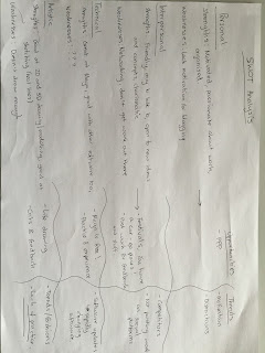
In this session we had to group up and talk about four topics which where what are strengths are, are weaknesses are, what opportunities there are, and who are threats.
Strengths:
I'm a fast learner, good with technology and software like Maya, After Effects and Photoshop, I work well in teams. I'm motivated in my work, I'm always looking for new projects to do and I'm open to new ideas.
Weaknesses:
I'm not very good when it comes to written work and documentation, I sometimes forget old techniques because I'm learning new things, and my time management can be improved. I also need to draw more.
Opportunities:
Things such as competitions, work experience, learning new things is a great way of gaining new skills and it gets your self promoted. Also going to festivals and meeting new people in the industry isa good way of connecting your self in to the industry.
Threats:
Treats would be distractions, competitors may be better than you, software will change so you need to have the ability to change with it. Also not posting your work on social media can make it harder to promote yourself in the animation industry.
Personal SWOT analysis |
Peer SWOT analysis |
Visual Response |
Lip Sync with Martin
Lip sinking is one of the most important things to learn in animation and there are around 9-11 main different mouth expressions used in dialogue, which can be split into vowels and consonants. Animating mouth movement is done by animating the the phonetics rather than the individual letter of that word, to get this wright you need to learn the phonetics of a word and even a group of wrods that would be spoken together.
The key thing to remember is that if you try and animate every single letter the mouth movements will be way to fast and it will end up looking weird. So animate vowels and only add punctuation shapes where necessary. The audio and be a couple of frames behind the animation but the animation can never be a couple of frames ahead because it'll be in-sync, and the shape of the mouth can form the sound of the word.
After learning about this I wanted to have a quick go for myself even though I've already done some lip syncing in a 3D animation. One of are tutors gave us an after effects file with a shape that has different mouth shapes and we had to get a piece of audio and then try and lip sync to it using the different mouth shapes. My audio was from the 3D animation that I had already done lip syncing for, so it made this task just that little bit easier.
I found this easy to do because it was just lining up mouth shapes to the audio so that it looks like it lip syncs. I feel like the hardest thing to lip sync will stop motion characters because you can't play the audio at the same time as the animation due to the fact that you're still modelling the characters lips to the sounds. I'd like to practice this further and develop my skills in this because I feel like I'm defiantly going to need this skill in the animation industry.
Wall Screen Projection
After going to light night in Leeds and also seeing one of my mate do some visual DJing I wanted to try do do something similar but with my own king of style added to it. So with the new plug in that I have in After Effects I tried to create a wall kind of model that can split in to multiple sections so that I can manipulate the different sections of the wall. Unfortunately I didn't really know how to do this so I went onto youtube to try and find a tutorial that would help me do what I wanted to do.
I found a video on youtube called 'Element 3D tutorial: Video Wall Screen' that told me that to get the effect that I wanted I had to go on Illustrator and create a grid, and once the grid had been create you copy and paste it into after effects. This is how I could create my wall projection effect, I placed the grid into the element 3D, the plug in for after effects, and then I extruded it and then beveled the edges to give it a sleeker look. I then experimented with the keyframes and changed the positioning of the wall so that it's not just static.
After doing all that I then had to fine something to project onto the wall so I went back on to youtube and gathered up some different light show animations so that I could use them on the wall I created.
To place them on the wall I used the video as a UV texture map of the wall and wrapped the light animations round it so that it would look like it had been projected on to the wall, And this was the outcome of my screen wall projection.
Polygon Motion Gaphics
For another part of this module we are expected to create a logo and an ident for are selves so that we can brand are selves in the industry. I wanted to do something motion graphicy or in 3D so I looked at idents on youtube and I came across an effect that someone does using polygons in After Effects and I really liked it so I wanted to see if I could try and create a similar effect.
I did this effect by using the mask tool and created a polygon out of that and then added an effect called 'radio waves' which made polygons come out in radial waves and so I tweaked some of the settings of the radio wave effect and added some keyframes in there as well. I then added a gradient ramp effect in there and made that the indicator as a start and finish point for the polygons to go around. I then added an adjustment layer so that the polygons would appear as if its going round in a circle, I did this by using an effect called 'time displacement'. After I did all that I just added a background and tweaked some more things to the way I liked them and I got this effect below.
After looking back at it I thought it wasn't going to be my logo or ident because I thought that it didn't really represent me as a 3D animator and visual effects artist. But I do still like the effect I've created and I'll probably us it in another future project. I did try this out with a logo that I designed and I asked people what they thought and they liked it but if I want my ident to reflect on the work that I produce then I need to create a better ident that demonstrates that.
The Imaginarium
The Imaginarium is a studio down in London the mainly focuses on Performance Capture which is another word for Motion Capture, this studio was founded by a well known actor-director Andy Seriks and producer Jonathan Cavendish in 2011. The studio specialises in applying motion capture technology in film, television and video games. The Imaginarium has brought together some of the world's leading Performance Capture and Visual Effects technicians to provide the highest level of character creation and storytelling.
Performance Capture is the technical process used to translate an actor's performance into a digital character. Each subtle facial expression, body movement and vocalisation is recorded via a synchronised array of specialised cameras and used to deliver a computer generated digital character. This process allows for direct real time communication and spontaneity on set between actors, and between actor and director.
The Imaginarium is developing and producing its own films, TV projects and interactive material using its unique Performance Capture expertise. They are starting to produce studio films and independent pictures, aimed at a large international audience. The Imaginarium is also preparing a slate of TV projects bringing to life its own creatures and characters, as well as adapting preexisting stories and character brands.
The Imaginarium also provide internships and work placements over a four week period with there production and development team. The placement involves reading script submissions, writing factual and critical analysis on potential and shadowing the Office manager in the day running of the company and various ongoing productions. This is something that I would like to do at some point either in the summer holidays or some time during third year. This would relate very well with my dissertation because I'm writing about technology and how it's being used in the animation industry, plus the effects motion captured animation differs from keyframed animation.
Sound Design Talk with Jan Meinema
In this talk we had a visit from Jan Meinema who is a senior lecturer at Bath Spa University. He had a long chat to us about sound design and how he's worked on animations and created sounds to fit in to the animations. I felt like the talk was quite informative but also his performance and the way he talked to us was quite dull. He did get me thinking about my animations and how the sound can change the effect of the animation, and how useful sound can be in my future animations.
I've used sound a lot in my animations and I know how effective it can be but I've mostly been quite comical with the sound so I feel like I haven't thought and carried it out correctly so that I get the best impact with sound in my animations. Jan then moved on to different sound recording devices and what device would be better use in different locations and occasions, and that you should maintain the same distance from the thing you're recording and the mic so that the sound in consistent throughout and so that you don't hear any reflective sounds in the space you're recording in.
Jan Meinema also showed us an animation so that he could demonstrate how sound can be used in an animation. He showed us an animation called 'Once Upon a Candle' by The Animation Workshop, and it demonstrates how sound can be used to create perspective and how you can zoom in to a character or a specific area of a scene by using sound. I found this animation interesting because it also showed us how sound can be used to make someone or something sound and feel like they're inside of something which is a hard thing to create if you don't know how to do it.
Fettle Animation Talk with Zane Whittingham
This talk was a surprise presentation from Zane Whittingham who works at Fettle Animation, which is a 2D animation studio in Huddersfield. They mainly do work from promotional films, children's TV, to animated documentaries to animated music videos. He showed us a collection of his work and what they do there at fettle animations, and in my opinion most of his work was in the same style and wasn't very good. He also talked to us about getting into the animation industry, and how hard it is. Zane told us about the freelance animators that they had worked with in the past and how not all of them had been what they were searching for. However, they had achieved success in other companies and people like Zane are referred to other creatives and clients. There was one part of the presentation that I didn't like which was when Zane said that in the UK we will never produce anything as good as Disney or Pixar, this angered me a bit because there is always new talent coming in to the animation industry and producing something amazing so maybe some time in the future we will be able to produce something like or even better than the US.
This talk did throw me off a bit because it was a surprise and we had know knowledge of the talk before hand. Having the knowledge before hand would of been great because I had a deadline the next day so I could of prepared myself for the talk. So as the talk was going on I was more focused on finishing my work and making sure everything is finished before the deadline, this made me not listen to the talk as mush as I would of liked so I didn't learn that mush from him and I feel like the talk was pointless to me. I also feel like the talk was pointless to me because his work and the animations he was showing us wasn't in my field of interest so again I wasn't paying much attention to the talk.
Pitch Perfect: Logo
As part of this brief of creating are own animation company Katy and I gave the job of logo design to Gavin because apparently he is really good at graphic design so he should do a good job. However, Gavin didn't really in my opinion put a lot of time and effort into making the logo designs because we gave him the task one day and in about one or two hours later he came back to us and said that he had come up with a logo for are company. In my head I was thinking that this was way too quick to come up with a design for a logo, I was expecting him to get back to us in a day or two.
His designs weren't all that impressive and eye catching to Katy and I and I feel like he used dull colours to represent are animation company. I also feel like he wasn't really thinking about the fact that we are a kids animation company so that logo has to represent that as well, which in my opinion it doesn't. We told Gavin this and said that the first logo he gave us was too graphic designy and it had too many sharp edges, Katy also said that it didn't suit are company and what we wanted. Gavin then when back and tried again, hoping for a better outcome at the end.
A while later he messaged us back and showed us these designs and asked for are opinion on them. I found this to be a bit cheeky on his behalf because all he'd done was gotten the first design and smoothen of some of the edges and said that it look more like a tent/den which would fit in with are name of the company. Unfortunately at this point it was too late to tell him that this wasn't okay because he gave us this a day before the deadline so we just decided to have the bottom left design as are logo. However, it was his job as well to place the logo into are presentation which he didn't so thats why the logo is missing from the presentation.
Maya Tutorials - Crash Simulation
As the years at college go by I feel like my animation skills in the software Maya increase, I say this because I recently watched an old video that I created in Maya where one object collides into another object and then I looked at another video that I recently created in Maya where an object collides much faster into another object and the differences are so noticeable and you can tell that my Maya skills have gotten better.
I say this because I'm very interested in 3D animation so I watch a load of youtube tutorials about how to do different things in the software Maya so that I can gain my abilities and be able to do tasks that employers will set me in the future without struggling in how to work the software. I have created many things in Maya from static models to fully animated animations and even did a bit of motion capture in Maya as well, so I feel like I am gaining skills quite fast and learning new things in Maya every day.
Going back to the two videos about the collision simulations, These were hard to do because my knowledge on using ncloths and the bullet tool in Maya aren't as strong as my modelling, rigging and animating skills. An ncloth is and does as it sounds, it basically makes an object like a flat plane for instance into a piece of cloth or any soft material. But it also can be used for collision simulations just by increasing some of the setting of the ncloth tool. Thats how I used it in my videos.
I would like to further my skills in Maya and learn how to do a crash simulation using real life objects or buildings because having the skill to be able to do that will make my showreel more interesting and it might even get me a job working on a film/game/animation that needs a collision simulation or just someone who is good with using Maya.
Sunday, 8 May 2016
Pitch Perfect: Competition
For this brief we had to look up different studios that where doing similar things to what are studio was doing so that we could see who are competition would be. One of the big worries for me was that there where a lot of 2D and 3D animation studios in the UK so the competition would be very hard to compete with. However some of the 2D and 3D animation studios don't base there animations around kids where are are studio does, so this narrows down the competition just a little bit. I research mostly Yorkshire based studios because that is where we are based but I did also researched further throughout the UK. It was interesting to see all the different types of distinct animations coming out of each studio and what made them unique from the rest, and how they promote themselves through out social media. The studios I researched in to are listed below.
- Studio AKA
- Flickerpix Animation Studios
- Fettle
- Absolutely Cuckoo
- Red Kite
- Fudge Studios
- Zodiak Kids
- Bloom Studios
- Kilogramme
- RJDM Studios
Pitch Perfect: Costs
To actually start up an animation studio you have to think about the cost and how much its going to be for the equipment, softwares, location, insurance, and not forgetting the salary for the people who are working for you. So Katy and I researched into how much it would cost us to get five Mac computers and two cintiques as a starting point and we found out that it would cost us about £6,850 for the lot. We then looked in to the different softwares different animation studios used, for example Maya, Adobe suite, cinema 4D, toon boom, TVPaint, and so on. We decided to go for the Adobe Suite because in there it has Photoshop, After Effects, Premier, Animate CC which are all useful for animating with and we already have experience in. For the 3D software we went for Maya and Blender because I am well skilled in Maya and Blender is free to use. The overall cost of all these softwares is £2,776.80 per year. The cost of the location is about £1,800 per year as well.
We then tried to find a company that could insure are studio and would include things like public and employer liability, building damage, business equipment, goods in transit and loss of revenue. Luckely we found a company called 'Finsbury Insurance Group' that gave us a quote of £2,538.16which covers the whole lot.
We then came up with a salary for the team and because Katy, gavin and I are the main people we thought that we should get more money than the rest of are team. We also thought that the supervisors should get payed less than up but more than the main animators in are team. So then the main animators would get payed normal minimum pay. This came to Katy, Gavin and I getting £7.40 PH, the two supervisors getting £6.80 PH and the rest of the team getting £6.20 PH (PH= Per Hour).
Over all to keep this studio running a year the cost of are equipment, software, insurance and location would be about £13,964.94. The cost of everyones salary a year would be about £36,720, So put them two together and the whole cost of running a studio a year for us would be about £50,684.96.
Pitch Perfect: Location
Finding a studio for are team to work in was quite hard to do because to have a studio for ten people is quite a lot of money. We wanted to stay local so we started looking at studios in Leeds because its a nice city to work in due to the fact that animation studios also work in Leeds and also that the BBC have an office in leeds as well which might higher are chances of getting are animations on TV. Also Leeds is quite a cheap city to live and work in which is helpful when starting up a business.
After a lot of research and speaking to one of are tutors Mike we found a studio in Leeds called Duke Studios, this was a good place to work in because of the big space and how all the other bills like electric, wifi and so on are all included in the rent. However, I spoke to some of the other teams in are class and they said that they were renting out Duke Studios as well. So I went back online and searched for other studios because I didn't want to copy everyone else and say in the same studio with my other competition.
I found another studio in Leeds called Patrick Studios which is a bespoke venue for artists and provides up to 34 quality studio spaces, resource areas, a double hight Project Space and the office and headquarters of East Street Arts, It is unique as it addresses artists' need for structured support outside of academic institution and fosters an ethos of professional development. This studio ranges between £95 - £250 per calendar month. The studio space includes:
- good natural lighting
- larger than standard doors with individual swipe access
- Dedicated phone and internet connection
- 24 hour access to studio and resources
Pitch Perfect: Team Roles
For are studio we decided to have roles so that we wouldn't have to be doing everything and so that the work load would be split fairly between the three of us. Doing this would make are studio run smoothly and efficiently. We also decided to have more than just three of us in the studio, we thought of having a team of ten in are studio so that animations would be leaving are studio faster and also we'd have a lot more content out there so that we can get ourselves noticed be other big time studios. However if we had got given a brief from a client and someone in are team was more qualified or specialised then they would take the lead on that brief and not someone who didn't really have the capabilities of managing the brief. Ultimately we'd all have to are part to make sure that we can achieve a better outcome of are animations and be more successful. The roles we were given are listed below.
James - Head Of Studio
- Managing Director
- VFX Supervisor
- Part Time Animator
- Pre-Production Manager
- Concept Artist
- Producer
- Animator
- Post-Producer
- One 2D supervisor
- One 3D supervisor
- Three main Animators (also included in pre-production)
- Two Post Production Editors
Pitch Perfect: Introduction and Our Idea
The 'Pitch Perfect' brief was another one of the PPP briefs where we had to get in to groups of 2/4 people. The brief intended us to work in groups and come up with an animation company and then present are company to the rest of are peers and tutors. Doing that will allow us the insight to how a business can be set up and how hard it is to set one up, it also shows us how expensive it would be to start up a company from scratch. For this we had to think about cost, location, business plans, team roles, and also are competition out in the real world.
I initially was in a group of two with Katy which I was happy about because we got along fine and even though are art styles were different it also benefited us well because it would broaden are abilities with in the studio that we have created. However, we were forced to have on another person in our group, which was Gavin, who I don't really associate with much so it was kind of hard working with him on this project.
Katy and I thought about are studio long and hard and decided that we wanted to have an animation studio which created entertaining animation for young children. Are studio will focus on making 2D and 3D animation with a bit of live action in there as well, this is because Katy is more of a 2D animator and specialises in pre-production and I specialise in 3D animation and post-production, where as Gavin is more into post production and compositer. So combining these seemed like a good idea and it will widen the opportunities to collaborate with other studios and freelancers. I believe that Katy and I have a good work ethic which to me is very important because this maintains a steady flow of work that can be produced in the studio. With the animations that we produce they will be full episodic stories and short films that are shown on YouTube and Vimeo but also aiming to be aired on live kids TV. However, we do freelance work like animated shorts and commercial work for small uprising businesses.
Friday, 6 May 2016
IPI Software / Motion Capture
Motion Capture has just recently been an interest of mine because I had to do an essay about it and it really stuck in my head, so I want to continue using and experimenting with motion capture. Mocap is basically a performance capture software where a person wears a tight suit with dots on it which are tracked but multiple cameras scattered around the room. The data that is captured by the cameras are transferred on to a computer and moulded onto a skeleton, from there a character can be combined to the skeleton so that the character is now able to move like the person or object that is being tracked by the cameras.
For my Context of Practice module I created an animation with demonstrates the differences between a character that has been animated using Keyframes and animated by using Motion Capture. For me this was really interesting to do because I got to learn how to capture my performance and then apply that performance onto a characters that I modelled in Maya. The software that I used for capturing my performance was called 'IPI' which uses two kinect cameras from an xbox console that are pointed at a 45 degrees angel to the subject. For my performance I did a boxing routine because it didn't have that much movement but still had an entertaining factor to it. This looked something like this.
However, I re-performed the motion capture because I thought that I could do a better performance, plus I didn't really like how me feet never moved. After I did that I transferred the data over to Maya and placed it onto me prebuilt character. This was an easier process than I thought it was going to be, but I did have to bind the skeleton to the character and then paint the influences in so it wasn't all easy. This is what the final outcome was.
I feel like this went well but I'd like to further my knowledge on motion capture so that I can create more animations using this technique because I find the performance to be more realist than if I was to keyframe it. I did also find a studio that just focuses of performance capture down in London called "The Imaginarium" which was created by the famous actor Andy Serkis who did the motion capture for 'Lord of The Rings' as Gollum and 'Rise of The Planet of The Apes' as Caesar. The Imaginarium do internships which are four weeks long so hopefully I'd be able to apply for one, so that I can gain more skills and knowledge about Motion Capture.
Studio Distract
Studio Distract is a 2D and 3D animation studio based in Manchester, they produce TV series, adverts and short films. They have multiple connections in the industry that are high end like Disney, Pixar, BBC, hasbro, the NHS and much more.
Studio Distract 2014 Animation Showreel from Studio Distract on Vimeo.
I'd like to work for this studio because they seem to have a lot going on for them right now and they know a load of big people in the industry. They do offer internships which I will apply for in the future but they only offer it to one or two people a year so I'll have to try and make an impression on them for me to get the job. I'd sat that they are probable best known for their TV series ' Boy and The Dinosaur'.
I'm also interested in working with this studio because they provide and product animations through Motion Capture, doing this by use cutting edge tools utilised on hollywood blockbusters to wirelessly capture live and simultaneous of the face, body, hand and audio in any environment without the use of markers. which is one of the things I'm really interested in at the moment and I would like to experiment with Mocap in the future in my final year at college. I also follow the studio on social media like Facebook so that I can keep up to date with what they are producing, they are also holing an exhibition in there studio to show off there latest work and this will take place some time in the summer holidays, which I will hopefully be going to.
Kettle Studios
Kettle Animation Studio is a 3D animation and visual effects based production, which create intricate, interactive digital assets to glossy, high-profile TV commercials- and hand clients back flexible, cost effective solutions.
Although they are specialist, they're not niche. They are infatuated with all media and technology, and as they say "the more we know, the more we grow. and the quality of our work grows with us." This influence me because it makes me not want to be a complete specialist in one area, I makes me want to learn new skills and abilities so that I am able to stretch across multiple departments in the industry.
Unfortunately I'm not sure if the studio do any internships or studio visits but I will be getting in contact with them and giving them my showreel so that they might contact me back for a chat.
I'm intrigued by this studio because they have many connections that are high end that they have done projects for, so this could help get my name out in the industry if I do end up working for Kettle. Also they do a wide range of media and on just stick to TV or advertisements so this could also open a wider range of opportunities for me to work in different areas of the animation industry.
Blue Zoo
Blue Zoo is a 2D and 3D animation based studio that's located in London, they create multi BAFTA winning animations and they craft creative playful CG character animation for all digital media platforms, with a fresh and quirky edge.
They range from children's TV series to striking commercials, short films and apps, and they have in-house skills to carry out all sizes of projects from just a twinkle of n idea to finished masterpieces.
Blue Zoo Animation Showreel 2016 from Blue Zoo on Vimeo.
I follow this studio on many social media websites like Facebook and Instagram so that I can keep up to date with there newest animations and projects. I do this because I really admire there work and how quirky it is but also how fluid the animation it, they mainly do 3D animation which is what I want to specialise in throughout my third year at college.
I have gotten in contact with Blue Zoo studios for a studio visit but unfortunately they only offer this serves to schools because the studio is so busy that they can't show around individual people every day. However, I'd like to do an internship with them in the future so that I can make my face familiar at the studio and so that I can make some connections in the real industry. This internship is for about six weeks and you get paid £300 a week which would help with the cost of living down in London throughout the internship, they also have many different types of internships like CG modeller and texture artist (which is what I'd like to do), character designer, and general artist.
Thursday, 5 May 2016
Design Spin FX
From an earlier post I did mentioning Iron Man it got me thinking and I was wondering if I could create one of those hud spinning projections things so that I'd be able to use it for a later project I want to work on. So again I went onto youtube and found some tutorials so I could learn how to create one and in my opinion it was really simple and easy to create one. To create one of these effects all I did was create four different kinds of spinning hud things and then at the end put them all together in a separate composition.
The first one I created was made by grabbing any kind of audio and import it into after effects and then add a solid layer and place an effect called 'audio spectrum' which creates a kind of audio wave and then I just experimented with the different display options which were Analog dots, Analog Lines, and Digital so that it will give me different visuals. After I got what I wanted I duplicated the audio spectrum two more times so that I can change the effects on them and just increase the visual appearance. This is what I ended up with.
For the second one I created I used the same effects from above but I changed it slightly, with the Analog lines display I placed an effect called 'CC Focus Motion Blur' which made the analog lines blurry when they moved about giving off a web like effect. I then just changes round some of the orders of the layers so that it didn't look exactly like the first one.
After doing these I then moved on to creating curved lines which moved around one another, which would create a more of a hud effect. I did this using a mask tool and then adding an effect called 'Vegas' which created lines that I could manipulate, then I just added an expression on the rotation so that it would go round in a circle. After doing this I then duplicated the lines and changed the settings on them so the it would look more random. This looked something like this.
I then went on to creating another one of these but with more detail so I did the exact same thing as before but just increased the amounts of lines in there and I also added in a dotted line just to spice things up a bit. This was the out come to that.
Before I put all of the above together I also created a square that was exactly a fourth of the composition size and then made the opacity flicker on and off using the expression wiggle. I then duplicated the square three more times so that there are four altogether and lined them up in the centre so that I could place an effect called 'pola coordinates' so that the four square would curl round and create a circle, then I added another expression so the the squares that are now in a circle could spin around.
At this point I could now start merging all of the above together to create a hud effect. This was quite simple enough to do because all I had to do was experiment around with the scale tool and the position tool to get them in the right place. I then added an adjustment layer to the composition so that I could change the colour of the huds to a blue. After changing the colour I then added another adjustment layer and placed an effect called 'bulge' so that I could animate all the huds expanding and been pulled in, but I also duplicated this adjustment layer and mover it lower down the other layers so that I would only change a few of the huds. Lastly I placed another adjustment layer so that I could change the colour of one on the huds to make it red just so there is a bit more contrast in the whole effect.
This was the final outcome of my experiment, I feel like I've done a good job of it and I'll be able to use different assets of this to help me out in another video I'm working on. I'm very pleased with the outcome of this because it's done what I've wanted it to do and it looks like a projected hologram, I also like how the hud come out and looks 3D which increases the quality of this effect. What I'd like to do with this next is make this an asset for another project where my face has been motion tracked so that I can place this round my eye and make it look like I'm searching for something and make me look a bit like Iron Man.
An Upgraded Shockwave
After looking back at my energy blast I figured out that I could do a better job if I just researched in to how I could create a shockwave effect. So I went on to youtube and looked up some tutorials and found some that took me step by step through how to do this and the effect to me looked really realistic and there are no third party plug-in to create this effect in After Effects. To create this effect all I had to do was use the fractal noise effect and the masking tool, which started the initial blast off. Once I'd had the initial blast I then duplicated it a couple of times and change the contrast and timings of them so that there is more detail and randomness to the blast, after that I placed another effect called 'pola coordinates' which morphed the blast in to a circle to create a shockwave effect. Now that I had a shockwave I duplicated it two more times and changed the scale and rotation to make it a bigger and more effective shockwave, and then I added another effect called 'bulge' which gives off the effect of the shockwave expanding out or pulling itself in.
Above is my shockwave creation that I put together in After Effects, I feel like I could of experimented more with the timings of the shockwave exploding out but all in all I do like the final outcome of this and I especially like how the bursts out really fast and then just fades out towards the end just like a proper blast would do. I also like the colouring of the shockwave because I didn't really mean to make the shockwave that colour, it was initially black and white so I mush of pressed something I don't know but I like it because it looks like a energy shockwave. What I don't like about this shockwave is that it leaves like a blue ring after the shockwave and I don't really know how to get rid of it and it's really annoying, so I might have to go back and see if I can do something to change this.
Subscribe to:
Posts (Atom)